Hi,
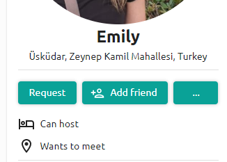
Under a user profile picture, unless the 3rd button will have multiple choices, a flag icon is better than 3 dots “…”

Hi,
Under a user profile picture, unless the 3rd button will have multiple choices, a flag icon is better than 3 dots “…”

Hey! I agree, but I think the plan is that there will be more options eventually 
It makes sense…