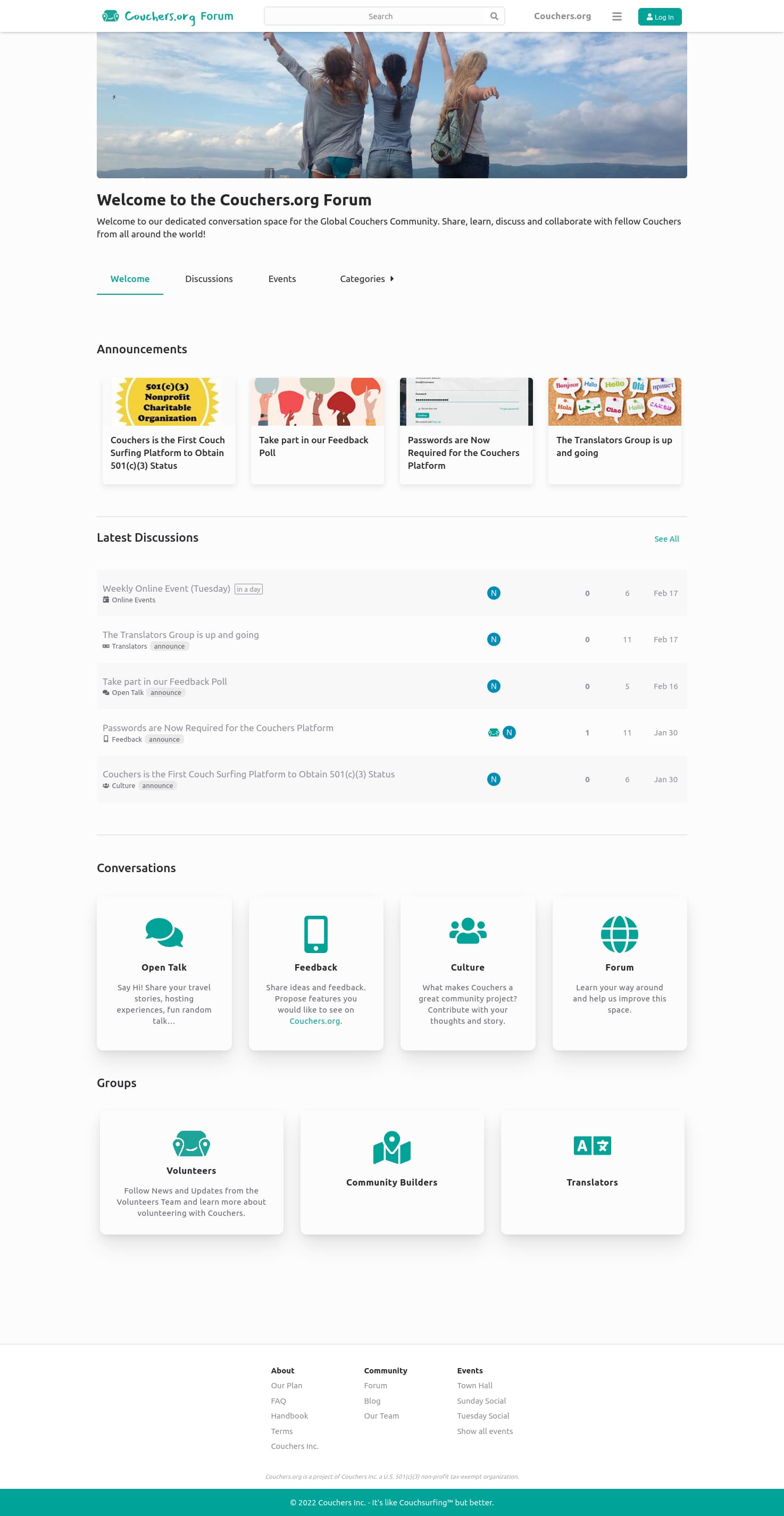
We’ve been working on a new forum setup the last couple of months and I’m excited to announce that we’ll be updating the forum with the new look and functionality soon! While we still smooth some corners you can already have a preview look and help us by sharing your feedback
For one we want to better express that there is one global Couchers community. Couchers is not a project that has a community attached to it. It’s a community project through and through. The forum is not a space where some separate community is talking about the Couchers project. It’s the space for the Couchers community to discuss all things Couchers on a global level. That’s why we align the forum with the look and feel of all Couchers communities.
Another aspect we want to support better is collaboration with and between members. We already host two member workgroups on the forum (Community Builders and Translators). Right now these groups are hidden from all members that don’t take part in them. The new setup will give more visibility to workgroups while still providing internal restricted areas.
Lastly, we also want to align the forum more with how communities are working on Couchers in general: based on distributed responsibility and accountability. Everyone who’s ready to meet certain standards and activity can propose to start a new local community or join the community builders of an existing one on the Couchers platform. The forum will work in a similar direction. We will have more category based moderation, so it’s visible who is taking care of specific areas of the forum. And the forum will be more open for members to propose and run new workgroups.
So yeah, very exited about bringing the changes to the forum soon! Thanks for having a look on the preview instance and sharing your feedback with us!
From a graphics perspective, it might be nice to have a splash or two of orange accent color on the page. And to be a little more welcoming, maybe some icons by the >Welcome >Discussions >Events >Categories (graphically, they could look more like the tabs they are). Like the way you’ve done the buttons under “Conversations” and “Groups” at the bottom of the page—those are really lovely but you don’t see them until you scroll! More of that, up top
Also, thanks everyone for the feedback so far! If you have more suggestions, please keep posting them here
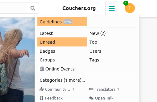
There are links for New and Unread topics right in the header menu now. Would that already help?
I see what you mean with a bit more color and making it more welcoming… we have a bit of a clean medical look right now Though it’s also aligned with the designs we have for the app… maybe we need a bit more playful look for the app in general?
I think so! A more playful look will distinguish us from the other hospitality apps No one else has a character/mascot, we should leverage our Couch Buddy to full advantage (in my opinion )
This may be off-topic, but I wonder if there’s a better name for the category “Culture”. A lot of topics focus on conceptual ideas and future feature design. At the same time a lot of topics do speak directly to curating our culture, like topics on dating, transparency, being invite-only etc.
I think with this new design we can take more advantage of these categories which is why I bring it up, this category wasn’t immediately clear to me.
I’m a bit confused about the new design (there’s always one).
Why do I now see two large pictures instead of forum topics (see screen shot) and some large text, none of which link to anything?
Why do I have to scroll half way down the page to engage or find out what’s new?
It feels to me like everything was clear before and now is hidden.
Yes, it’s unfamiliar and I’m one of those annoying people who is reluctant to change. Nevertheless, it previously looked and worked like a forum to me. Now things have changed, but it isn’t clear to me exactly how, or why. Maybe there’s a list somewhere of changes?
In terms of the changes that have been made, how do they meet your goals, as outlined above?
I’m sure there was a logic to this, but I’m going to need re-onboarding if I’m going to be able to continue to contribute.
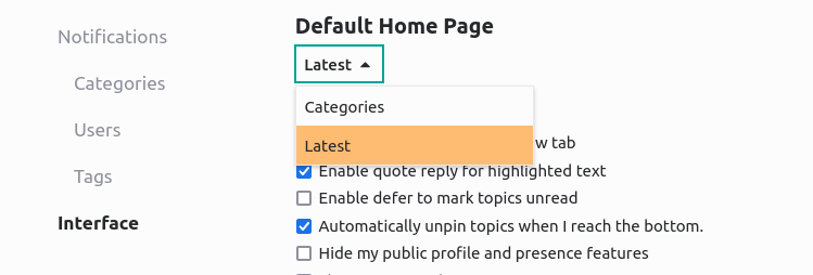
But the new theme uses components and navigation items that are based on a single homepage setting - and that’s at odds with this additional option. We’ve disabled this setting now. In case you still see two banners on the homepage, please send a message to the @team team.
So I’d hope navigating the theme without these glitches would already clarify some of the other concerns you raised. Happy to get back to them in more detail later though!
Yes, thanks for bringing this up. I also wonder if we can find a better name here!
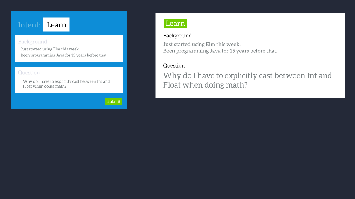
One of the goals of the new layout is to support better what can be called “Intentional communication”. The idea is based on the assumption that conflicts and arguments in online exchanges often arise because the conversations lack context. Tone, motivation or intent of the participants can easily be misjudged. For participants it’s not straightforward to understand which kind of behavior is considered appropriate or inappropriate. Evan Czaplicki gave a great talk about this concept where he argues in length that this is complicated by the fact that big providers of social platforms make money from engagement - and thus have designed model platforms that thrive on excitement rather than understanding. E.g. by not discerning intent or context, but by decontextualizing conversations and mixing all and preferably most different motivations and priorities. If anyone is interested, that talk is https://www.youtube.com/watch?v=o_4EX4dPppA (though be warned he actually only starts presenting the concept around 40 mins in… and then runs out of time ).
Here’s a slide how he sees this implemented on a potential platform:
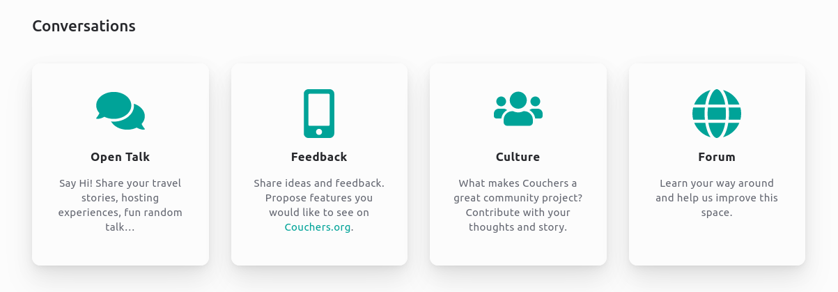
While we don’t want to structure all forum conversations that strictly, we’ve also seen conflicts arising from different understanding of tone and intent of the discussion. So we are picking this up a bit by more clearly presenting distinct conversation spaces:
Before we had one category Conversation with sub-categories Safety and Governance. Topics from these sub-categories are in Culture now and general conversations in Open Talk. So Open Talk invites jumping in with chatty and casual comments. While the idea for the Culture category is to signal that’s a context asking for more reflected and thought-out contributions. When you take part it’s expected you are also more mindful of understanding other member’s background and story. The intent is discussing foundational and general matters for the overall project.
Coming back to the start of this, Culture is probably not the best label for this area. Someone has a better idea?