It would be practical to have a link backwards to the forum Home menu, as every time we click on one, example : Discussion and knowledge then go to a topic, we lose the main menu.
Thanks
Hi Ronba and welcome to the forum! If you click on the couch logo and Couchers.org handwritten logo it takes you back to the main page. Is that what you mean? 
Hi, silly me, I didn’t think about it thank you.
I would rather like to have one that lead you directly to last posts.
Yes, the default home is set to Categories, but you can change that in your account settings:

It’s in Preferences/Interface.
This time I searched and didn’t find a link to open the main app in a new window.
Of course having a menu with links to all main pages of Couchers would be better as there could be more parts building up with time.
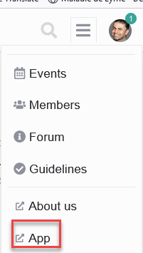
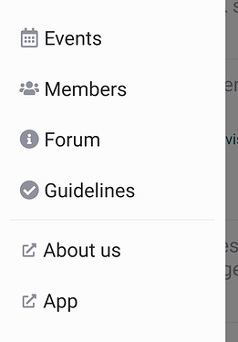
If you open the menu panel, you have the links to other Couchers pages at the bottom:
This is from the mobile view and is the same setup as on the app.
On the desktop view you also find the links in the menu panel, just that the menu icon is on the right side of the header bar. Should we put additional links directly on the header bar?
From the app on the desktop we see the following:
and we can go to the forum.
But you are right there is the App link:

The reason I didn’t pay attention to it is that the word App didn’t ring immediately I was looking for Couchers .org or something similar in the name.
For me the main brand is Couchers not App which is common description. App is more common in the smart devices rather than desktops.
Thank you
The reason behind the wording is that the page with overall background information about Couchers is at couchers.org. And the web-app is at app.couchers.org. It was planned to integrate all the information in the web-app page. But maybe not, because we will also have a mobile app in the works?
In any case, that’s why we didn’t put couchers.org neither for directing to the web-app nor for the project page, because it can be ambiguous for both. But went for ‘About us’ and ‘App’.
Do you have a different suggestion for the wording?
Alright then, I understand.I guess I got lost between the multiple sub-sites and the main one.
I don’t have a better suggestion for now, I am sorry for the confusion.
Thank you for taking the time to reply each time.
Small suggestion to improve the ergonomy : in profile/edit URL, the save button should not go any lower than the “About / Community / events” square : when the user is cscrolled down to the max, the button may be unseen.

