Overall forum design

Ok, so I’m new (a few weeks) to Couchers but old (15 years) to Couchsurfing. Allow me to give first impressions of the Forum site, which I reckon as structured might be a roadblock to growth:

(1) There is Couchers.org and Community.Couchers.org and they’re two different sites and there are two different logins. This really wasn’t clear to me.
- Can they not both be on the same site?
- If not, do we really need a separate login?
- If so, mention should be made explicitly of the fact that you’re heading to a different site. I was furiously trying to log into the Forum site with all known passwords from the last 10 years and it was telling me it didn’t even recognize my email address.

(2) When not logged in, you can still scroll through the posts of Community.Couchers.org, but it shows older posts first. This was offputting, because I initially had the impression that people hadn’t been posting on here since 2020.

(3) The tabs are higgledy-piggledy. They seem to be the fruits of idea upon idea piled on top of each other but they lack order. In more detail, there are 20 elements to take in when you log in:

  • First thing you see in logging in is (1) " Welcome to the Couchers.org Forum"
  • Then a picture of some girls trying to touch God…or, like me, trying to find the top of the ribbon (2)
  • Then a tagline (3) “Welcome to our dedicated conversation space…around the world!”
  • Underneath that are four tabs: “(4) Welcome / (5) Discussions / (6) Events / (7) Categories >”
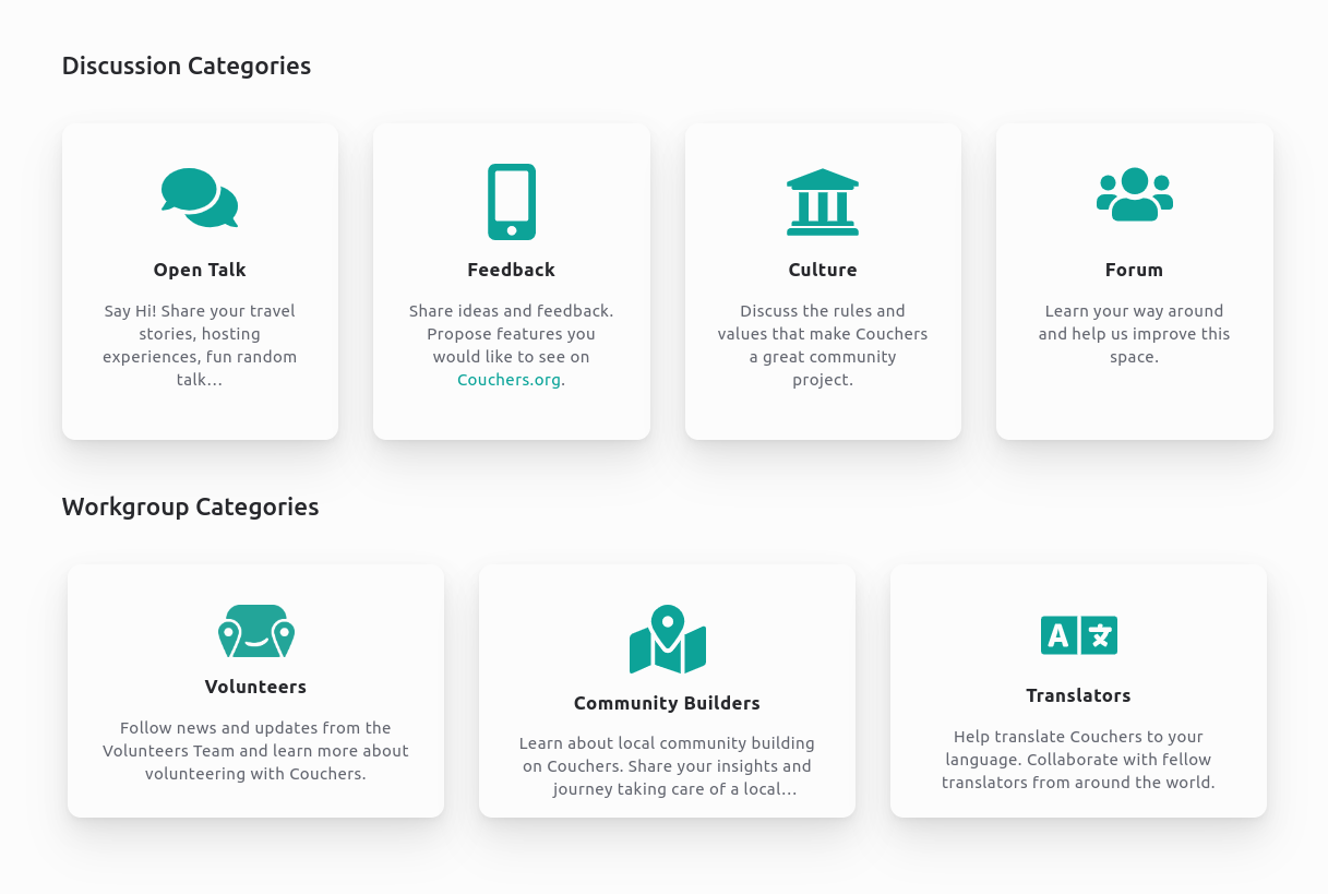
  • Categories contains eight sub-tabs: “(8) Open talk / (9) Feedback / (10) Culture / (11) Forum / (12) Volunteers / (13) Community builders / (14) Translators / (15) Online events”
  • Clicking on Events, you get another sub-tab called (16)“Online events”
  • Underneath that are four headlines: “(17) Announcements / (18) Latest topics / (19) Conversations / (20) Groups”

Without wanting to get too existential, where should this very post even exist. There are 8 places where I can see it fitting in. I opted for feedback, but even that I reached only by clicking on a 21st element, “Open draft”, and seeing the categories list.

Could this not be cut down dramatically, by:
- Getting rid of (1) and (3) (I mean we’ve had to log into a completely different site to go to the forum, so we know where we are - we got here deliberately).
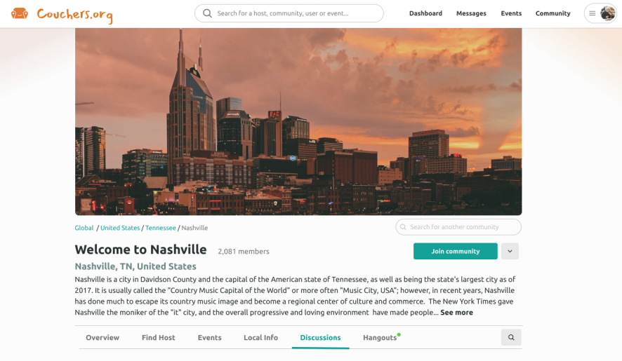
- The picture is too prominent and takes up too much space. The photo in the discussions forum gets 10 points for ethnic diversity but only a few points for fun (the girl and guy front of frame carrying the team). These people are not having fun, so why would anyone carry on reading?
- Have the tab options at the top (look at Fb, Amazon, any retail site): people need to be able to see the tabs, they shouldn’t be nested half-way down the page.
- The topics are very blah and the pop-up notes even more so. E.g. Hovering over Welcome gives “Forum overview”, hovering over the sub-category “Forum” gives “Forum”…
- I get having “Discussions” and “Events” as tabs - but all the other tabs seem senseless to me. Why is “Categories” separate from discussions for example. Couldn’t it be a subset of Categories, since everything in the list basically involves discussions e.g. (a) Open talk, (b) Feedback, etc.
- Announcements, latest topics, groups and conversations is very prominently displayed on the splash page. Announcements looks particularly bad because the latest one dates back to January 2022. I’m sure y’all be doing something since then?

(4) I think you’re missing the most important tab here, which is “Who are we?”. Couchsurfing is on life support because it became faceless and corporate, so take the opposite tack: become face-full and personable. Some suggestions:
- Fine if you don’t wanna have a top-down approach, but I see names popping up in posts and unclear who the F these people are in the structure. When Jesse posts (he does a lot - sorry to use your name in vain, Jesse), who is this guy? Community builder tells me nothing, because in another post I see that there are a long list of people waiting to be community builders. I see gpoovan post, who is also listed as a community builder, and yet he introduced himself elsewhere as head of marketing or something. Aapeli is a co-founder - well have these people listed. I read you have 500 contributors to development or something - well mention that team (by country or contribution or something if you don’t want to list every person). When suggestions are made, who is it that says “yes, that’s a good idea, we’ll work on it.”
- You mention all these volunteer positions: well add some cache to it by having said people displayed on this page. I applied for one such volunteer position weeks ago and I haven’t got a clue whether my application was received, whether the position has already been taken - it’s all very opaque, because we don’t know who does what.
- Likewise, the “community builder” position is confusing. Jesse says there are a mountain of them to get through. Fair enough, but show us said mountain. You probably have a list of people who have applied and for the area they applied for: well show it then. I’m about to move to a good hub for Couchers in Europe, but have no idea whether 20 people from that city have already offered their services.

This post is TLDR for most, but for those who did, thank you and congratulations for reaching the end.

1 Like

If you want a forum, there’s phpBB, why the flipping 'ell reinvent the wheel?

Instead of the Couchers.org Forum you mean?

Thanks for the feedback @Davecogz! Some of my thoughts:

We still run a dedicated forum platform because so far we don’t have the infrastructure in place on Couchers.org to host and curate all our online conversations. Couchers.org is the dedicated app we’re building from scratch. This forum is based on an existing forum software, Discourse.

The discussion we have on the forum right now will eventually all take place on the app within the Global Couchers community. That’s why the forum design follows our main community design:

So the plan is to move the parts that are implemented to the app. The first content we’ll be able to move are events. We still have those on the forum because notifications are not fully implemented on the app yet.

One step towards better integration now is to have single-sign-on for both sites. I’d love to see that as well and just brought it up again internally.

About organization, Discussions is listing topics from all categories in chronological order. We then have 4 categories to group those conversations: Open Talk, Feedback, Culture and Forum. And we have 3 workgroup spaces: Volunteers, Community Builders and Translators.

I consult companies on community design. Typically they have many categories, like 20+ and I advise them to condense to 4-8. Do you have examples of communities that operate with less than 4 main areas? I’d be curious to learn about that.

Yes.! phpBB is established, supported, and you can concentrate on the real thing!

Thanks Nolo, this makes much more sense: coming to think of it, it does look more like your content has been tailored to an off-the-shelf product than conscious design choices to make it the way that it has been made.

Four categories is fine and what we use in the organizations that I work for too. But at the moment, the categories are spread too diffusely and illogically, giving the appearance of more.

Why not have on the splash page four categories: (1) Welcome (if you really must - I personally don’t see the point in that page); (2) Discussions (divided into the subcategories: (a) Open talk; (b) Feedback; (c) Culture; and (d) Forum); (3) Events; (d) Groups (divided into: (a) Volunteers; (b) Community builders; and (c) Translators). That solution would cut the size of the Welcome page in half (because Groups and Conversations would be removed), and would channel the “Categories” into their logical places.

Also, when you explain the whole thing it makes sense, but there seems a bit of a gap between plan and execution re the naming of everything. The main bugbears:

  • “Discussions” (in the tab) are the same as “Conversations” (on the welcome page). Maybe harmonize the name to Discussions?
  • “Groups” (on the welcome page) you described in your message as “Workgroup spaces”. Workgroup spaces, or at least just “Workgroups”, says much more to me than “Groups”.
  • I tend to advise clients to avoid nebulous words like “Categories” that mean different things to different people. I really would scrap that name and parcel off the categories themselves to their relative areas.
  • “Events”, on clicking on it, gets its name magically transformed to “Online events”. That’s confusing.
1 Like

Yes thanks, we indeed should be more consistent. I changed the top nav to that:

And I renamed Conversations and Groups to Discussion Categories and Workgroup Categories:

And yes, dropping the Categories dropdown and rather having two dedicated ones for Discussions and Workgroups was my original idea too! But as we’re using a platform, it’s not that this is just a plain dropdown menu. It’s based on a template that groups others templates and logic. I’d need to duplicate that which would lead to a bunch of follow-up issues. Or build one custom menu and unfortunately it would all require a level of customization and future maintenance that seems a bit out of proportion.

Though we could name it sth like Spaces or Areas instead of categories?

Btw, I didn’t get back on your feedback about team presentation. How about rather moving that to a dedicated topic? It’s also not only about the forum but about our presentation overall.

Sorry, only just getting back to you about this. I like the relabelling as “Overview” and “Online Events”, and totally get that the site is based on a template so a lot of the ideal rearrangement jus isn’t possible. I think it’s already more understandable.

A few more thoughts though:

  • The link between Topics, Categories and Discussion is still unclear. It’s just a nomenclature thing, where you’ve got too many vague concepts: “Discussion”, “Category”, “Forum”, “Topic”, “Event”, “Workgroup” which all mean something very specific but that will be unclear to the unintiatied. “Topic”, in particular, has pretty much the same generic meaning as “Category”.
  • I would therefore recommend as follows:

(1) Conflating “Topics” and “Categories” as “posts”. So the second tab would be “All Posts”.
(2) Move “Categories” between “All Topics” and “Online Events”. Since Categories is basically just a filter of the All Topics, have it next to it.
(3) Rename “Categories” as “Posts by category”.
(4) Therefore, on the Overview tab, rename “Discussion Categories” as “Discussion posts”; and “Workgroup categories” as “Workgroup posts”.
(5) The “New Topic” button would therefore have to be “New Post”.

Another thing, that goes back to the separation between the Forum and Couchers.org:
(6) Why not rename “Feedback” as “Feedback on Courchers.org” and “Forum” as “Feedback on Forum”.
(7) Likewise, put the current “Forum” block between the current “Feedback” and “Culture” blocks. Just a logic thing: Forum and Feedback are both effectively asking for input, whereas “Culture” is more general.

About the overview tab:
(8) “Latest topics” under Overview and “All topics” is the same. Duplication and waste of space. I would get rid of that list from Overview.
(9) Personally, I think that it’s harming you having “Announcements” as the first thing under “Overview”, the reason being that the four current “Announcements” are all several months old. It makes it seem that the platform is dead if you’ve had nothing to announce in months. That saps potential user and donation growth. Short of redesigning a specific less conspicuous tab for announcements, I would suggest having “Discussion posts” as the first thing that you see in Overview, “Workgroup posts” as the second thing and “Announcements” as the third.

As suggested, I’ll make a separate post about team presentation.

1 Like

About nomenclature, I can follow your ideas. But again, we use a ready-made product that comes with a logic: Categories hold topics and topics hold posts. And that’s not only used on this interface here, we also have a backend where forum mods can curate content and admins organize the site. Re-arranging this logic on the frontend will either lead to confusion on the backend. Or we’d need to design a custom ontology for the backend as well. There’s no plan to do that.

About the landing page and the layout in general. Here’s a complete view of the community mockup it follows:

As mentioned before, the plan is to eventually host all community discussions on the app: local discussions on the local community pages. And the global discussions on the global community page. The global page doesn’t need to mirror the local pages. But it would more or less follow a similar layout. That’s what we are exploring with the current forum design and why I put up some elements like the announcements boxes that are aligned with similar highlight boxes for hangouts on the local communities.

But I get that featured elements actually look bad when there’s not much to feature. That’s maybe also interesting for the local community pages… @groovydom would we have an adjusted design when a community is not really buzzing with content?

Also, maybe we should actually align the look more? We use categories right now, because we started out with a common forum organization. But we actually won’t have categories on the app. We’ll just have discussions. And probably groups. I’ll explore that on the staging instance: Just having one overall Discussions feed that is organized with tags. And changing the current Categories dropdown to Groups only.

@nolo You raise a good point about adjusted design for non-buzzing pages. While it may not be necessary to create a new design (we would want to maintain a consistent framework across pages), there are definitely ways we can introduce engaging content. For example, we could introduce content from a nearby community or its associated larger community (i.e. country).

I would be interested to hear other people’s takes as well. The feedback is really helpful!

1 Like